
Power BI report hints and tips
Many pages on Lancashire Insight include a Power BI report to allow users to interact with visuals and explore the data. This webpage gives an overview for navigating and using these reports.
If a report does not seem to be working as expected, try refreshing the report or switching to another browser (e.g., Chrome or Edge). Some visuals have longer load times (such as maps of small geographies), so may take some time to show.
Navigation
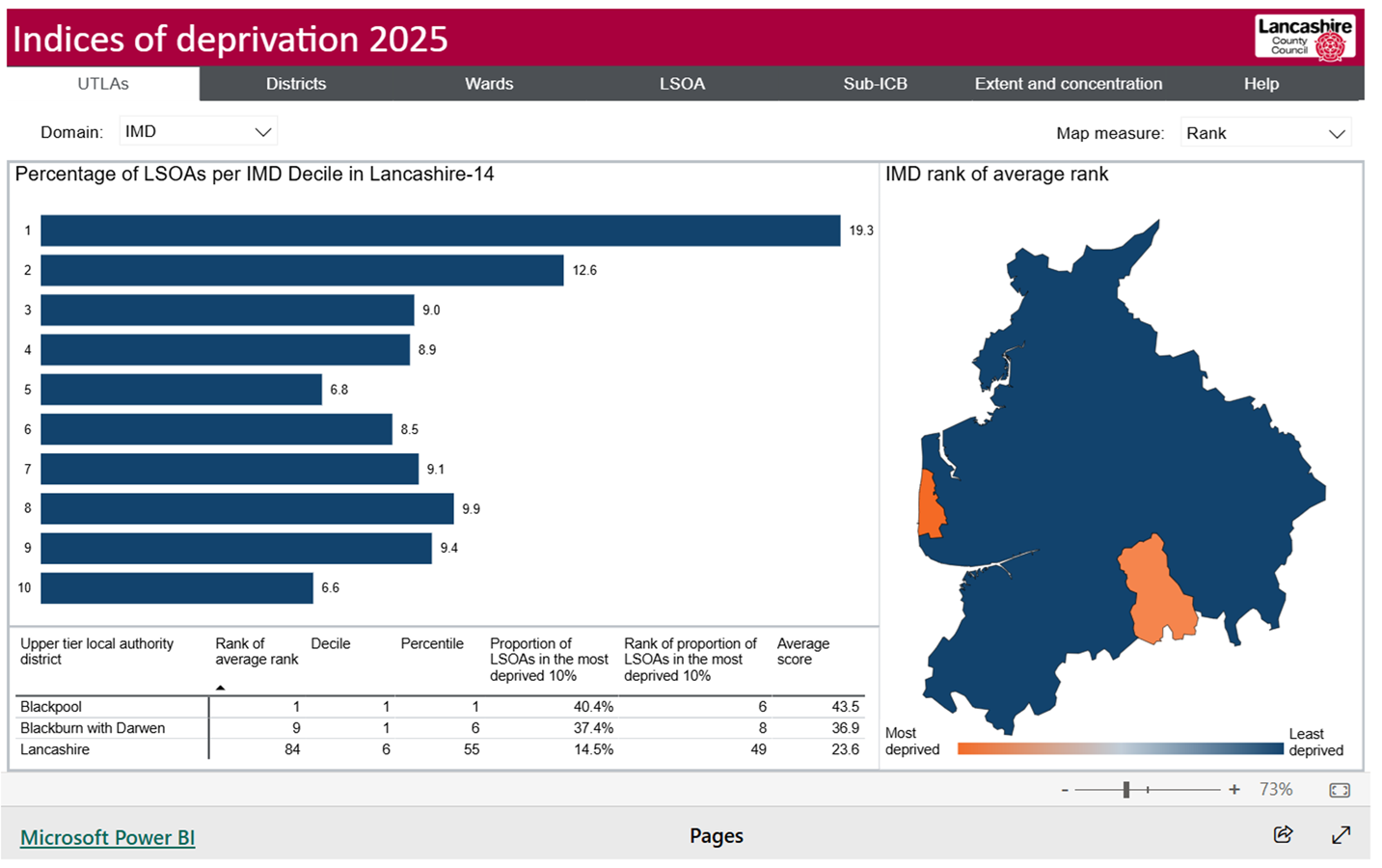
Our Power BI reports usually include multiple pages. Click on a page tab on the navigation bar to move to through the pages. The active page tab is highlighted in white.
Example: report pages
The active page on the report below is 'UTLAs'. The other page names in the navigation bar, including 'Districts' and 'Wards', can be used to navigate to these pages.
Selection options
Most reports include selection options known as filters or slicers. These allow users to set preferences such as geography, time or measure.
Some slicers allow multiple selections to be made, while others only provide single selections. When you make a selection, the data shown will automatically filter to match the selection. On multi-selection filters, selecting multiple options will show the data for all those selections. If nothing is selected on multi-selection slicer, all the available options will be shown.
On most reports, selections have to be remade when the page is changed. Not all the data shown on a page will update with selections, only those that are relevant.
On many reports, the visuals (including graphics and tables) themselves can be used to filter or highlight the data. These can be interacted with by clicking areas or cells. These work in the same way as slicers and automatically update the data shown to match the selection.
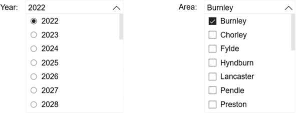
Example: using slicers
The 'Year' slicer allows for single selections of each year, while the 'Area' slicer allows for multiple areas to be selected. Clicking on the drop-down arrows of these filters displays the expanded list that can be scrolled through.
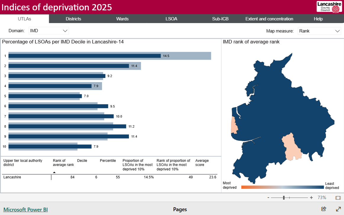
Example: using visuals and tables for selections
In the report below, the Lancashire County Council area has been selected on the map on the right by clicking the area. This has updated the bar chart to overlay Lancashire-12 percentages (dark blue) over the Lancashire-14 percentages (light blue). The selection has also filtered the table on the bottom left to show only the data for Lancashire-12.
Tooltips
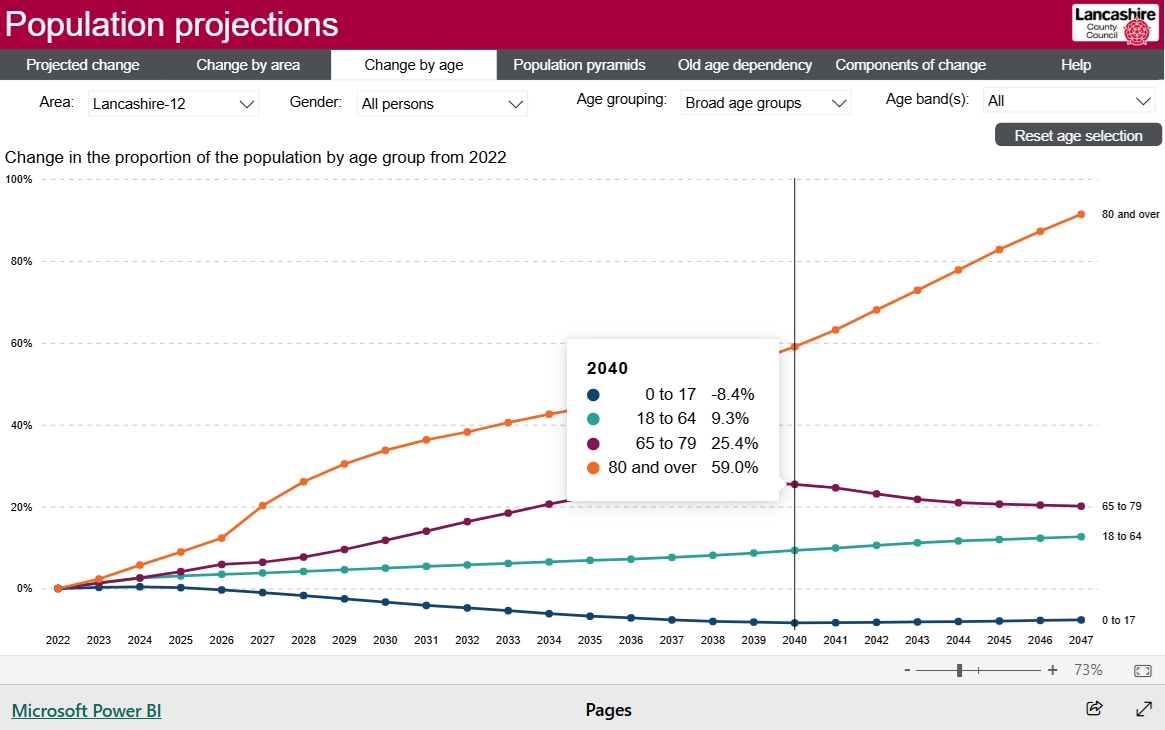
Most visuals include tooltips which give extra information or allow values to be more easily read. These can be shown by hovering the cursor over a visual.
Example: tooltips
Copying visuals
The best way to copy parts of a report is to use a screen capture tool, such as Microsoft's snipping tool. The captured visual can then be pasted directly into a document or saved as an image file.
Printing
There is no specific print function in Power BI. The print option in the web browser can be used to print the active page of the report.
Full-screen mode
Full-screen mode can be used to view reports in a larger size. Click on the double-headed arrow in the bottom right corner of the report to enter full-screen mode.